The Three Pillars Of A Good Messaging Platform

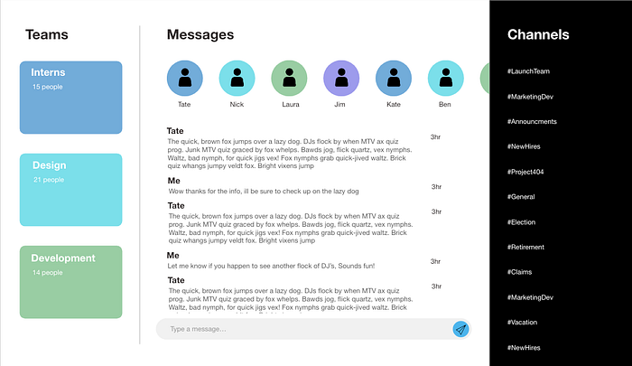
Messaging is a widely used and underappreciated aspect of all applications. The process is so familiar however that a designer need not stress when it comes to building their own. There are three main parts that make up the application; the contacts, the screen where you build each of your messages, and the current chats.
The contacts portion of your applications is one that is fairly simple to build. In order to do so, you need to decide on the appearance of each contact. This means deciding if they will be avatars, letters, photos, or a combination of the three. Nowadays it is common to see photos since these can be easily integrated into the app through linking a previous account such as Facebook or Google. A profile photo that is accompanied by the first name of the person is usually a good starting place when designing your messaging app.
On the page of your application where the user sends their messages there exist a few mandatory components expected for your user to send the message. These include a button to send the completed message, space for the user to write out their message, and a portion of the screen displaying previously sent and received messages. The send buttons’ appearance should replicate common designs of other apps so that the user does not need to learn in order to utilize your application. Therefore a simple arrow or paper plane looking icon usually works best. When creating the drafting bar (area in which the message is written) you also want to follow in the footsteps of commonly used design. Offering recognizable ways of drafting out a message will save the user time, and lead to a better user experience. The part of the page displaying previously sent and received messages offers the opportunity to be a little more creative. Since the user isn’t directly interacting with this portion of the page you can alter the design to make it fit the branding and feel that you like.
It is important to have a page dedicated to listing off the chats that are currently in progress. This allows the user to see all active conversations and easily navigate between each chat. Some applications do this by displaying who is in each conversation, while others use titles to effectively sort out each group. An example of the titled conversations can be found on group messaging platforms such as Discord and Slack.
Once you have included the contacts page, the message drafting space, and a list of active conversations your app now has all the requirements to be a successful messaging tool. From here you can now take the liberty to brand it as you want, as well as experiment with different color themes and features. One important trait in a messaging app is its simplicity, so always try and keep it as straightforward as possible and don’t go overboard on the aesthetics.